Haunting #1 by Phil Falco
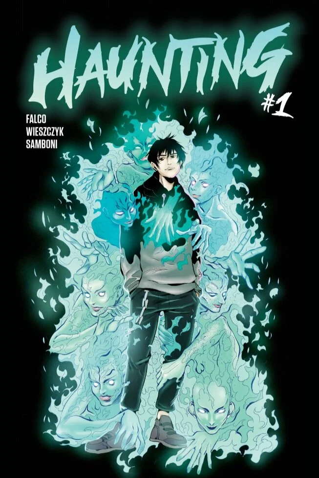
Haunting #1 was a successful Kickstarter project. The book is beautifully drawn by Anna Wieszczyk with colors by Andres Samboni and letters by Lettersquids. The book is about Bram, a young man who deals with being the cause of the appearance of mischievous ghosts. Let’s get into it:
Story
At the beginning of the story we are introduced to Bram. If someone has died and Bram is in the room where it happened, there’s going to be ghosts. Lots of ghosts. Bram is not terribly interested in interacting with the ghosts and is actually pretty annoyed by them. In fact, the story begins with him asking why the hotel manager lied to him about whether anyone had died in the hotel he was staying in. The customer is always right Hotel Manager!
Bram hits the road, looking for a ghost-free hotel. He is being pursued (unbeknownst to him) by a man named Deacon. He’s got the smoldering villain look we love. He’s cunning and evil and he makes for a good villain. As Deacon closes in on Bram, he even kills someone to see if a ghost will appear, using Bram’s powers against him.
Without spoiling anything about the story, we thought it was well paced and interesting issue and definitely kept our attention. We wanted to know what happens next (which is a plus for a first issue). If there was a negative, it was that we have yet to know why Bram is so disinterested in the ghosts that appear. We also agreed that we need to know more about why Deacon is pursuing Bram soon. It was very vague and we couldn’t tell if Deacon was trying to capture Bram, kill him, or a little of both… I’m sure that will be revealed in future issues.
Art
The art for this book reminded us of 100 Bullets by Brian Azzarello and Eduardo Russo. The line art is very realistic and almost gave off a noir feeling. While the main characters and “real world” were very realistic, the ghosts in the comic were drawn with a lot of energy and dynamism. Anna Wieszczyk creates a very realistic world where ghosts seem like the most believable part of the story. It is a testament to the amount of detail she has put into each panel. Much like a story like Ghostbusters, the rest of the world must be grounded in reality for the supernatural to seem natural to the rest of the story.
Colors
The colors for this book were muted, again paying homage to the book 100 Bullets. We especially enjoyed the contrast between the highly saturated ghosts and the rest of the environments. It made the supernatural parts of the story feel very vibrant and energetic.
Letters
The letters were a little bit generic but they were very not noticeable or distracting from the story. There are times the letters can enhance the storytelling, but we didn’t really see that in this book. On the other hand, letters can sometimes take a reader out of the story, which again we didn’t experience in Haunting #1.
je ne sais quoi
We both felt excited to find and read issue #2 (which as of writing this review, has not come out yet). The x-factor for this comic was the way it dealt with the supernatural as a grounded reality that the characters were used to and dealt with in specific ways. Whether it was the townspeople being attacked by the ghosts, the main character Bram trying to ignore them, or the villain using them to complete his own goals, the ghosts were really uniquely created for this story in a way we had never seen before.
Rating:
On a scale between Trembling orphans finally getting adopted by billionaire parents and The gum on the bottom of your shoes forming consciousness and spreading to other articles of clothing we had no choice but to give this comic a strong Surprise concert by Beyonce on an Amtrak train (amazing but possibly a bit too loud).
Learn more about Haunting #1 and get project updates on their Kickstarter Page!

